
Why the Right Responsive Web Design Agency Changes Everything
A responsive web design agency builds websites that automatically adjust to fit any screen — phone, tablet, or desktop — so every visitor gets a smooth, consistent experience.
If you’re looking for the best fit fast, here are the top things to look for:
- Proven portfolio across industries and device types
- Mobile-first approach built into their core process
- SEO integration — responsive design and search rankings are directly linked
- Conversion focus — good design should drive calls, leads, and sales
- Transparent communication with no surprise fees or lock-in contracts
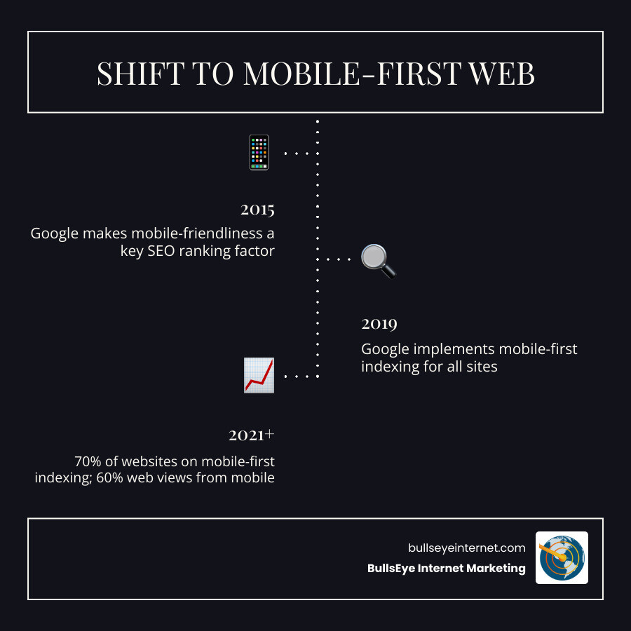
Nearly 60% of all web page views worldwide now come from mobile screens. And Google has already shifted the majority of websites to mobile-first indexing — meaning it ranks your site based on how it performs on mobile, not desktop.
That’s not a trend. That’s the new baseline.
Yet many business owners are still running sites that look broken on a phone, load slowly, or push visitors straight to a competitor. The cost is real: 40% of users abandon a page that takes more than three seconds to load, and 40% will switch to a competitor after a poor mobile experience.
A responsive website isn’t a luxury upgrade. It’s the foundation of your online presence.
I’m Ronnie Katz, founder of BullsEye Internet Marketing, and since 2006 I’ve helped businesses grow their revenue online through SEO, PPC, and conversion-focused web design — including working with responsive web design agency partners to ensure our clients’ sites perform across every device. In the sections below, I’ll walk you through exactly what responsive design means, how to evaluate agencies, and what to look for when choosing the right partner for your business.
Must-know responsive web design agency terms:
Why Your Business Needs a Responsive Web Design Agency
In today’s digital landscape, your website is often the first point of contact between you and your potential customers. Whether they are sitting at a desk in Miami or browsing on their phone while waiting for a coffee in West Palm Beach, their experience needs to be flawless. This is where a responsive web design agency becomes your most valuable partner.
The statistics are impossible to ignore. 62% of global organic search traffic now originates from mobile devices. If your site isn’t optimized for these users, you are effectively closing your doors to more than half of your potential market. But it’s not just about being “visible”—it’s about how you treat those visitors once they arrive.
Research indicates that 74% of people are likely to return to a site if it works well on mobile. Conversely, 40% of users will jump to a competitor if their mobile experience is poor. This makes responsive design a direct driver of user retention and brand trust. When we look at how a web design company improves UX, we see that it’s about reducing friction. A responsive site ensures that buttons are clickable, text is readable, and forms are easy to fill out, regardless of the device.
For startups and growing businesses in South Florida, the stakes are even higher. Google has already shifted 70% of websites to mobile‑first indexing as of early 2021. This means if your mobile site is lacking, your search engine rankings will suffer across the board. A professional agency ensures your site isn’t just a pretty face; it’s a high-performing business tool designed to convert traffic into sales.
Technical Principles of Modern Adaptability
To the average user, a responsive site just “works.” Behind the scenes, however, a responsive web design agency uses complex technical principles to ensure that magic happens. Unlike old-school web design, which relied on fixed widths (like “this site is 960 pixels wide”), modern responsive design is fluid.
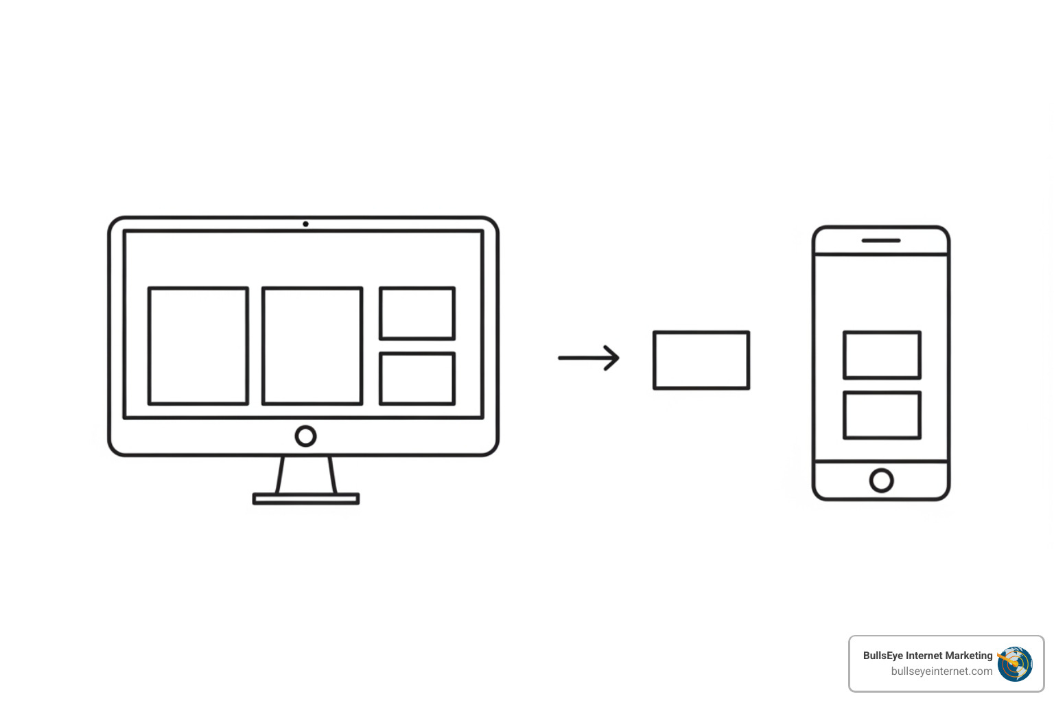
The foundation of this approach is flexible grids and relative units. Instead of using fixed pixels, designers use percentages or “fr” units. This allows the layout to expand or contract like an accordion. Coupled with this are fluid images, which are set to a maximum width of 100% so they never overflow their containers and cause that annoying horizontal scrolling.
Media queries act as the “brain” of the operation. These are bits of code that ask the device, “How wide is your screen?” and then apply specific styling rules based on the answer. These transition points are known as breakpoints. Following mobile website design best practices, we focus on making sure these transitions are seamless, ensuring performance optimization and accessibility for all users.
To help you understand the landscape, we’ve put together this comparison:
| Feature | Responsive Design | Mobile-Friendly | Separate Mobile Site (m.dot) |
|---|---|---|---|
| Adaptability | Fluidly adapts to any screen size | Fixed layout, scaled down | Different site for mobile only |
| SEO Impact | Best (Single URL, Google preferred) | Moderate | Poor (Splits link equity) |
| Maintenance | Easy (One site to update) | Moderate | Hard (Two sites to update) |
| User Experience | Seamless and consistent | Can be clunky | Often limited content |
| Future-Proof | Yes (Works on new devices) | No | No |
Core Principles Used by a Responsive Web Design Agency
When you hire a top-tier responsive web design agency, they aren’t just using basic templates. They are leveraging advanced tools like CSS Grid and Flexbox to create complex, multi-dimensional layouts that remain stable on any device.
A key part of our guide to building websites that adapt involves using viewport meta tags. These tell the browser how to adjust the page’s dimensions and scaling to the width of the screen. By focusing on scalability and relative units—like using “em” or “rem” for typography—we ensure that your brand’s message is clear and legible whether it’s on a 5-inch smartphone or a 27-inch desktop monitor.
How to Choose the Right Partner for Your Project
Choosing a responsive web design agency is one of the most significant decisions you’ll make for your business. It’s not just about who can build the “prettiest” site; it’s about who understands your business goals and can translate them into a digital experience that drives growth.
Start with a deep dive into their portfolio. Look for diversity—have they worked with e-commerce, B2B, and service-based businesses? Do their sites load quickly? 40% of users abandon a page that takes more than three seconds to load. Technical expertise is non-negotiable, but communication is equally important. You want a partner who explains the “why” behind their design choices.
In our review of website design best practices 2025, we emphasize the importance of user journey mapping. An agency should be able to show you how they guide a visitor from the initial landing page to the final conversion. With 63% of organic search traffic coming from mobile, your agency must prioritize the mobile user journey above all else. This focus on the user experience is what ultimately leads to a measurable sales lift.
Selecting a Top-Tier Responsive Web Design Agency
At BullsEye Internet Marketing, we take a different approach than your average responsive web design agency. We understand that for businesses in Florida—from Fort Lauderdale to West Palm Beach—competition is fierce. You don’t just need a website; you need a competitive advantage.
Our USP is built on three pillars:
- No Long-Term Contracts: We believe our results should keep you with us, not a legal document. This keeps us hungry and focused on your success every single month.
- Geographic Exclusivity: We only work with one client per industry in a specific geographic area. If we are building your responsive site and running your SEO in Miami, we won’t work with your biggest competitor down the street.
- Conversion Focus: We specialize in generating calls and sales. Whether we are providing custom WordPress web design services or managing a high-spend PPC campaign, every pixel is designed to drive a lead.
By integrating SEO from day one and ensuring PPC synergy, we create a digital ecosystem where your responsive design works in tandem with your marketing strategy to maximize ROI.
Frequently Asked Questions
What is the difference between responsive and mobile-friendly design?
While they sound similar, the difference is significant. Mobile-friendly design means a site can be viewed on a phone, but it’s often just a shrunk-down version of the desktop site. This leads to tiny text and buttons that are impossible to tap.
Responsive design, on the other hand, provides fluid adaptation. The layout actually changes—images resize, menus collapse into “hamburger” icons, and columns stack—to provide an optimal user experience on every device. When we implement UX design for WordPress, we ensure the site is truly responsive, ensuring full compatibility across the entire spectrum of modern devices.
How does responsive design impact my SEO rankings?
Google explicitly prefers responsive design. Why? Because it makes their job easier. With a responsive site, you have a single URL and the same HTML code for all devices. This leads to better crawl efficiency.
Furthermore, responsive design helps with bounce rate reduction. If a mobile user clicks your link in search results and finds a site that is hard to navigate, they will “bounce” back to the search results. Google sees this as a sign that your site didn’t meet the user’s needs, which can lower your rankings. Our WordPress website design firm guide covers how a unified site structure is the gold standard for modern SEO.
What is the typical timeline for a responsive redesign?
A quality project shouldn’t be rushed, but it shouldn’t drag on forever, either. A typical timeline involves:
- Discovery Phase: Understanding your brand, goals, and audience.
- Wireframing: Creating the blueprint for the site’s structure.
- Prototyping: Designing the visual look and feel.
- Development & Testing: Building the site and testing it on dozens of different devices.
- Launch: Going live and monitoring performance.
For many web design services for small business, this process usually takes between 8 to 12 weeks, depending on the complexity and the number of custom features required.
Future-Proof Responsive Web Design: BullsEye Internet Marketing
When the majority of your customers are carrying your storefront in their pockets, you cannot afford to have a website that fails to adapt. A responsive web design agency isn’t just selling you a website; they are selling you a future-proof digital strategy that scales with your business.
By focusing on user-centric design and technical excellence, you create a competitive advantage that pays dividends in long-term growth. Whether you are a startup in Coconut Creek or an established firm in Coral Gables, your digital presence should be as professional and adaptable as you are.
Ready to transform your online presence and start generating more leads? Don’t settle for a site that only works half the time. Partner with a professional web design company that prioritizes your ROI and offers the geographic exclusivity you need to win. At BullsEye Internet Marketing, we’re ready to help you go beyond the pixel and build a site that truly works for your business.
